


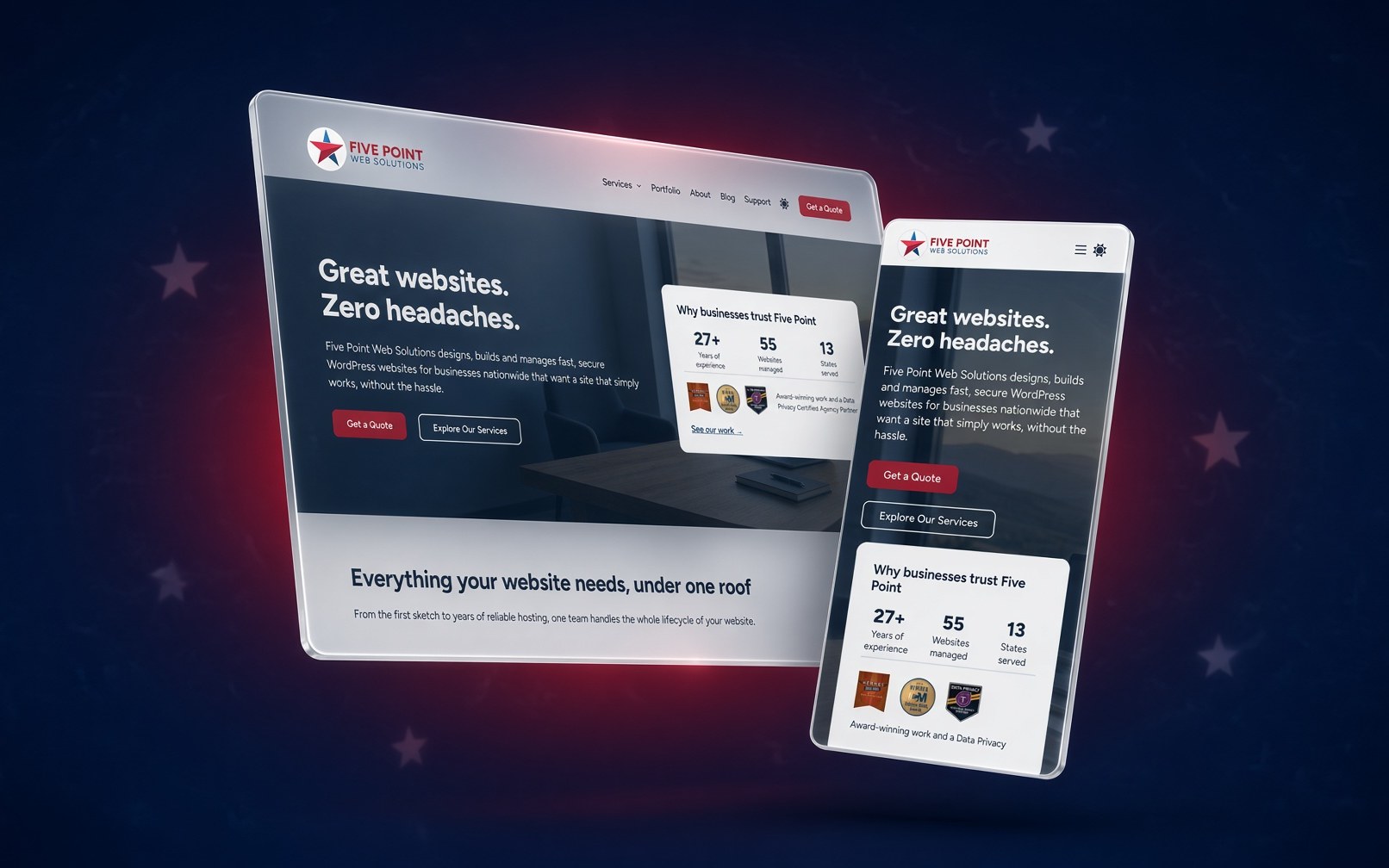
Our new website is officially live!
You know the saying about the auto mechanic who drives a jalopy? For years I’ve been building and rebuilding websites for clients while our own site waited its turn. This time I gave Five Point the same treatment I give every client project: a careful plan, a clean design, and the same modern tools I use on the sites I build and manage every day.
Here’s a quick tour of what’s new.
A real look at our work
The new Portfolio has 24 projects, from law firms and surveyors to a chamber of commerce, a nonprofit and a memoir author. Each project has its own page with screenshots of the desktop and mobile versions, a link to the live site, and where the client is located. Click any screenshot to see it full size.
Simpler, clearer services
We’ve always offered a range of services, but over the years our service pages multiplied and got a little confusing. We’ve consolidated everything into four clear areas:
- Web Design: a site that looks great and works on every screen
- Web Development: custom functionality built on WordPress
- SEO Strategy: helping the right people find you
- Website Management: hosting, updates, security and support, so you never have to think about the technical side
Each page also shows a few real projects related to that service.
Easier ways to get in touch
- Have a project in mind? Start a Project walks you through the details that help me give you an accurate quote.
- Just have a question? Ask a Question is a short, simple form.
- Already a client? The Client Support page is the fastest way to get help.
The Five Point Focus newsletter
Our newsletter is back, and it’s going monthly. Expect practical website tips, security heads-ups and the occasional behind-the-scenes look, with no fluff and no spam. You can sign up on the Newsletter page, or tick the box when you contact us.
Built with accessibility in mind
Accessibility got the same attention as the design. We scanned every page and post with an automated accessibility checker, tested the site using only a keyboard, and checked color contrast in both light and dark mode. A few things we changed along the way:
- Links say where they go (“More about Web Design” instead of “Learn more”)
- Links open in the same tab, so your back button works the way you’d expect
- Headings follow a logical order, which helps people who navigate with screen readers
- Form fields are clearly labeled and follow a natural keyboard order
No website is perfect for everyone, and we’ll keep improving. Our Accessibility Statement explains our approach and how to let us know if something gets in your way. The same practices go into every site we build for clients, and ongoing accessibility monitoring is now available as an add-on to our Website Management Plan.
Light and dark mode
Prefer a darker screen, especially in the evening? Use the toggle in the header to switch between light and dark mode. Both versions were checked for readable color contrast, so the site is just as easy to read either way.
Built mobile-first
About half of all website visits in the U.S. now happen on phones, so every page was designed for small screens first and then scaled up for tablets and desktops. Menus, buttons and forms are sized for thumbs, not just mouse pointers. If you’re curious why this still matters, see Why Your Website Still Needs to Be Mobile-Friendly.
Thank you
To every client who has trusted us with their website: thank you. Many of you are in that portfolio, and I’m proud of the work we’ve done together.
Based in Idaho’s Treasure Valley, we work with businesses nationwide. Have a look around. If something on your own website has been bugging you, let’s talk.
Add your first comment to this post