


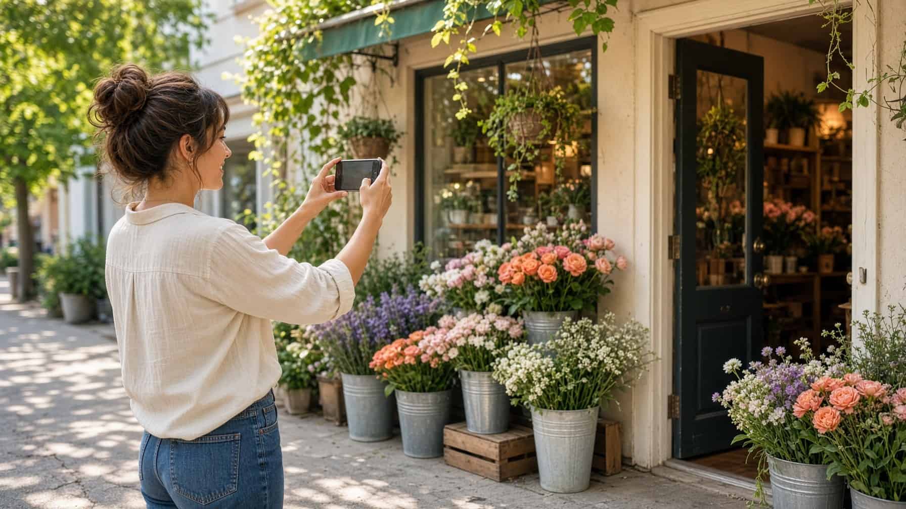
If you’re working with a web designer on a new website, photos have probably come up. Hiring a professional photographer isn’t always in the budget, and that’s okay. With a little know-how, you can take great photos yourself. Here’s how to take photos that look good on your website, with special attention to those tricky background images. We’ve included some examples along the way.
Why photo size and shape matter
When it comes to website photos, two things matter most: the ratio (the shape of the photo) and the focal point (the main thing you want people to see). Websites aren’t like photo albums. They need to look good on phones, tablets and laptops, so your photos have to fit different screen sizes without looking stretched or blurry.
The ratio describes how wide a photo is compared to how tall it is. You’ve probably seen terms like 4:3 or 16:9 on your camera or TV. Different ratios work better in different parts of a website. Here are the main types you’ll need.
Common photo types
Landscape photos
Landscape photos are wide and usually have a ratio of 16:9 or 4:3.
- What it is: Wider than it is tall, like a movie screen.
- Where it works: Headers, banners and large sections at the top of a page.
- How to take it: Hold your phone or camera sideways and leave extra room on the sides. That gives your designer room to fit it on different devices.

Portrait photos
Portrait photos are tall and usually have a ratio of 3:4.
- What it is: Taller than it is wide, like a selfie.
- Where it works: Blog posts, sidebars and other spots that need a vertical image.
- How to take it: Hold your phone upright and keep your subject away from the edges.

Square photos
Square photos have a ratio of 1:1.
- What it is: The same width and height.
- Where it works: Team headshots, product photos and small images.
- How to take it: Center your subject with a little space around it. If it’s too close to the edges, it may get cropped on some screens.

Background images
Background images are the large photos that stretch across a section of your website, like the main image on your homepage or the backdrop behind a contact form. They grab attention, but they can be tricky if the photo isn’t quite right.
Background images are set to “cover” their whole section. That means the photo grows or shrinks to fill the space, whether someone is on a small phone or a large desktop monitor. The catch is that if there isn’t enough space around the focal point, the photo may get zoomed in too far, cut off or look fuzzy.
- The problem with portrait photos: A tall, narrow photo doesn’t have enough width to stretch across a wide screen. The website zooms in to fill the space, and your dog’s cute face turns into a giant blurry nose.
- The problem with tight shots: Even a wide photo can cause trouble if you’re too close to your subject, like your storefront. There’s no extra space, so the edges get cut off or the photo looks pixelated.
- How to fix it: Take wide, landscape photos with plenty of room around the focal point. Hold your phone sideways, step back a little and take the shot.
Think of it like framing a family photo. If you try to fit a photo into a frame turned the wrong way, you’re left with empty space or you have to trim the photo to fit.


Quick tips for taking website photos
- Use good lighting: Natural light works best, so shoot outside, near a window or in a well-lit room. Avoid dark, shadowy photos.
- Clean your lens: A quick wipe removes smudges that make photos look hazy.
- Keep it steady: Hold your phone with both hands, or prop it on something to avoid blurry shots.
- Skip the filters: Natural colors look more professional and are easier for your designer to work with.
- Take a few options: Take a square, a tall and a wide version of the same subject so your designer has choices.
- Think about space: Leave room around your subject, especially for background images. Many phones have an ultra-wide setting (often 0.5x or 0.6x) that captures more of the scene without stepping back. Just keep in mind that it can bend straight lines near the edges.
- Send the originals: Share full-size photo files instead of screenshots or photos saved from social media, which are smaller and lower quality.
Ready to start snapping?
Taking photos for your website might feel a little overwhelming at first, but with some practice, you’ll be sending photos that make your website look its best. If you’re not sure about a shot, send it anyway. Your designer can let you know what works. And since great photos work best alongside great words, here’s what to tell your copywriter.


Add your first comment to this post